Back to projects
Increasing Bakery's sales by improved ordering process
UX Design • Web Design • Responsive Design
Overview:
This is a redesign of my first website project that was part of my UX design certificate. The website was originally designed for a family-run bakery with several locations across England, offering a number of cakes and baked goods as well as customised cakes. They offer local delivery and collection in one of their branches.
THE PROBLEM
The old design was outdated and lacked basic design principles which resulted in poor UX and UI and was not effective enough to attract new customers. The delivery and collection options were not clear enough to understand how they work. The way how the user could customise their cakes was very basic and customers would still have to email or call the marchant to order something more specific.
THE SOLUTION
The Redesigned website focuses on enhanced UX and engaging visuals attracting more customers. The checkout procees now includes an easier way of choosing delivery or collection. The bakery has a dedicated page for bespoke cakes where customers can build and order a customised cake, choosing exactly what they want.
TOOLS:
Figma • Photoshop
DISCOVERY PHASE
User Research, UX Audit & Competitive Analysis
The research phase was conducted during my UX certificate and the redesign is based on those findings. I surveyed and interviewed over 40 participants.
Key findings:
Search functionality is important when customers have a product in mind
Ordering a bespoke cake can only be made via email/phone/DM
Users want to know immediately what is the product range like
Customers appreciate visually appealing and quality images of the products with no distractions
Customers expect delivery or collection option
A thorough description of the products with nutritional and allergen information is crucial
Quick and easy checkout process without the need to register
As part of the redesign, I audited the old website design to identify any flaws in the user journey and the visuals. Several issues needed addressing.
Contrast issues
Hero images lacked context
Poor quality images
Complicated checkout process when choosing a collection
No further information regarding deliveries
No way of ordering custom product from scratch
I also analysed direct competitors' websites to identify strengths and weaknesses. This helped me to understand what sets Cakeland apart and what improvements were needed.
The old designs
Design Phase - Planning
SITE MAP
Based on the user research findings, I defined the key sections and pages. I then worked in the hierarchy to see how these pages are related to each other and how users will go through them.
KEY FEATURES
Option for both delivery and collection, understanding of how to book a slot
Ability to build and order a bespoke cake from scratch
Easy browsing experience (search function, clear navigation, clear categories and attractive visuals)
Detailed product pages (description, allergies, ingredients, weight/size of the product)
Customer ratings
Simplified checkout process - as few steps as possible with a progress indicator
Guest checkout
WIREFRAMES
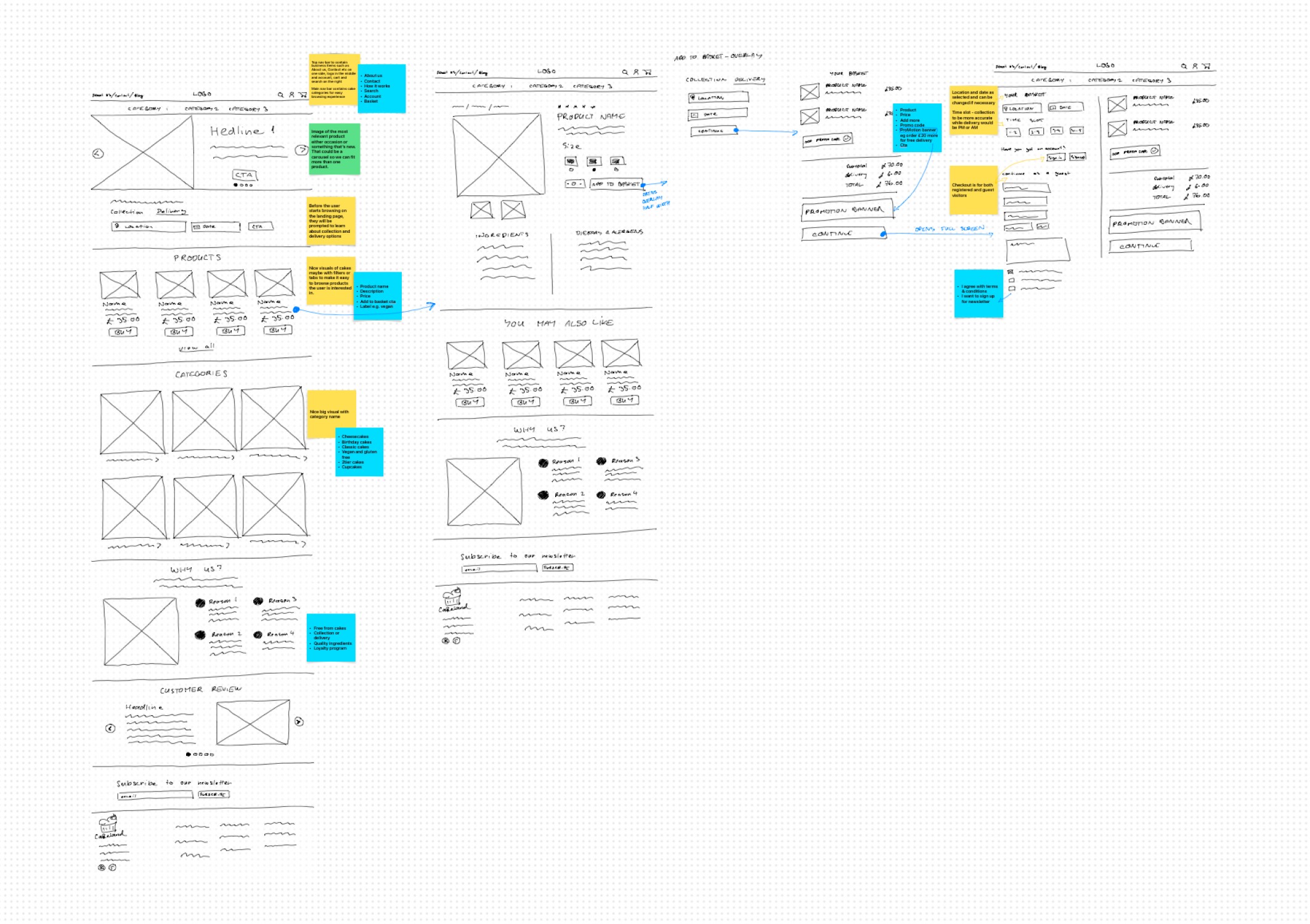
I created wireframes of the main user journey to visualise the new design. At this point. During this process I was able to refine the layout and functionality.
Design phase - Visual Design
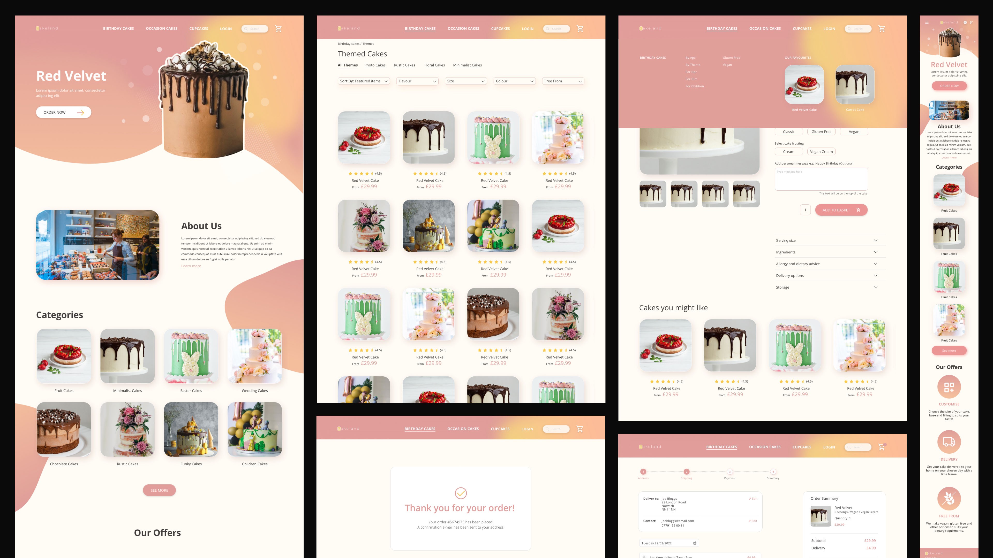
I aimed to create an inviting atmosphere, reflecting the business’s cozy and friendly image. Key design elements included:
Enhanced colour palette to reflect the brand ensuring following WCAG guidelines
Clear typography for legibility
High-quality images of the products
Improved way of customising a bespoke product
By addressing all the previous issues the website had, the redesigned project not only retained its inviting feel but also ensured that every visitor could enjoy a seamless browsing experience.
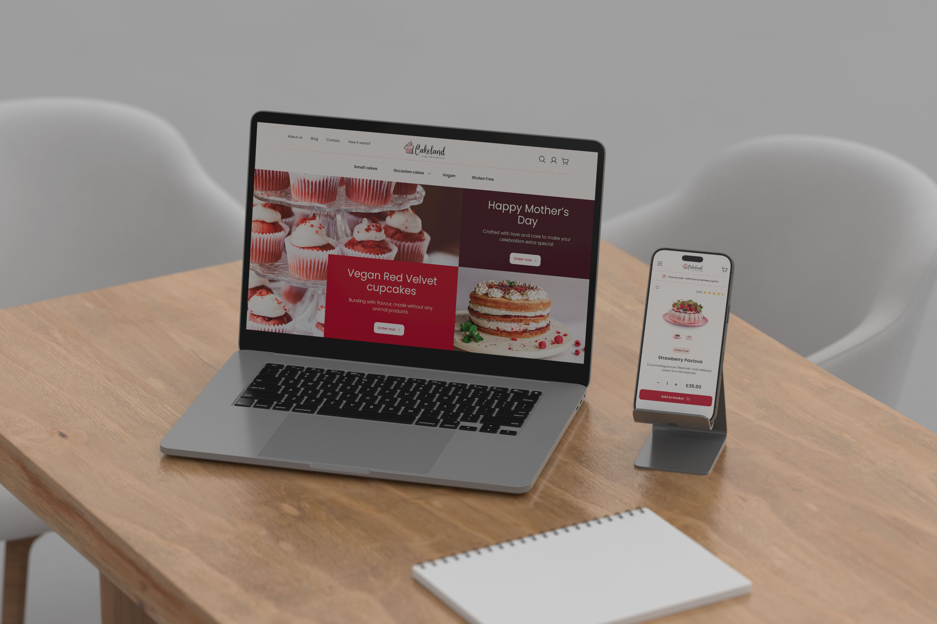
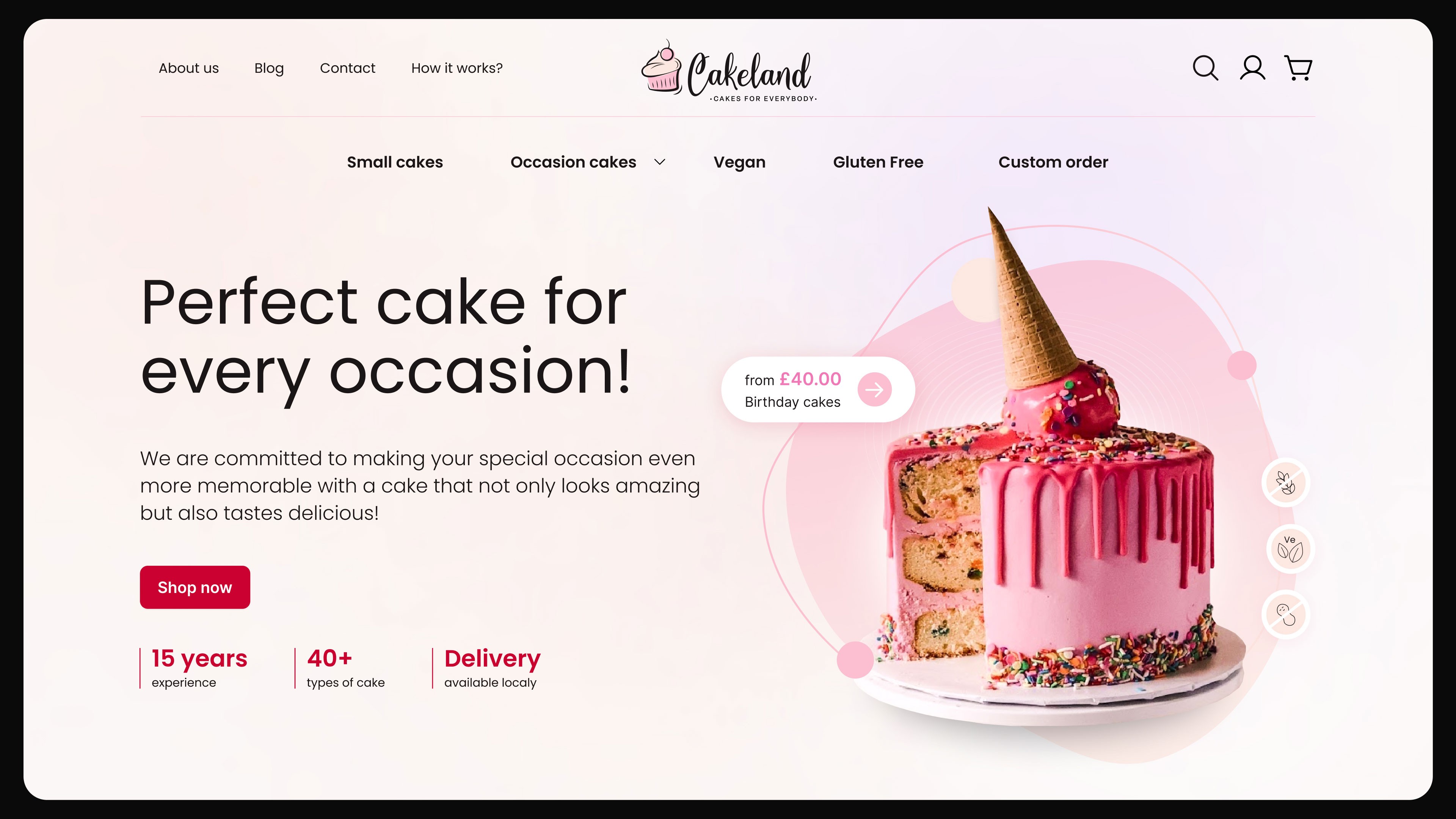
Landing page hero
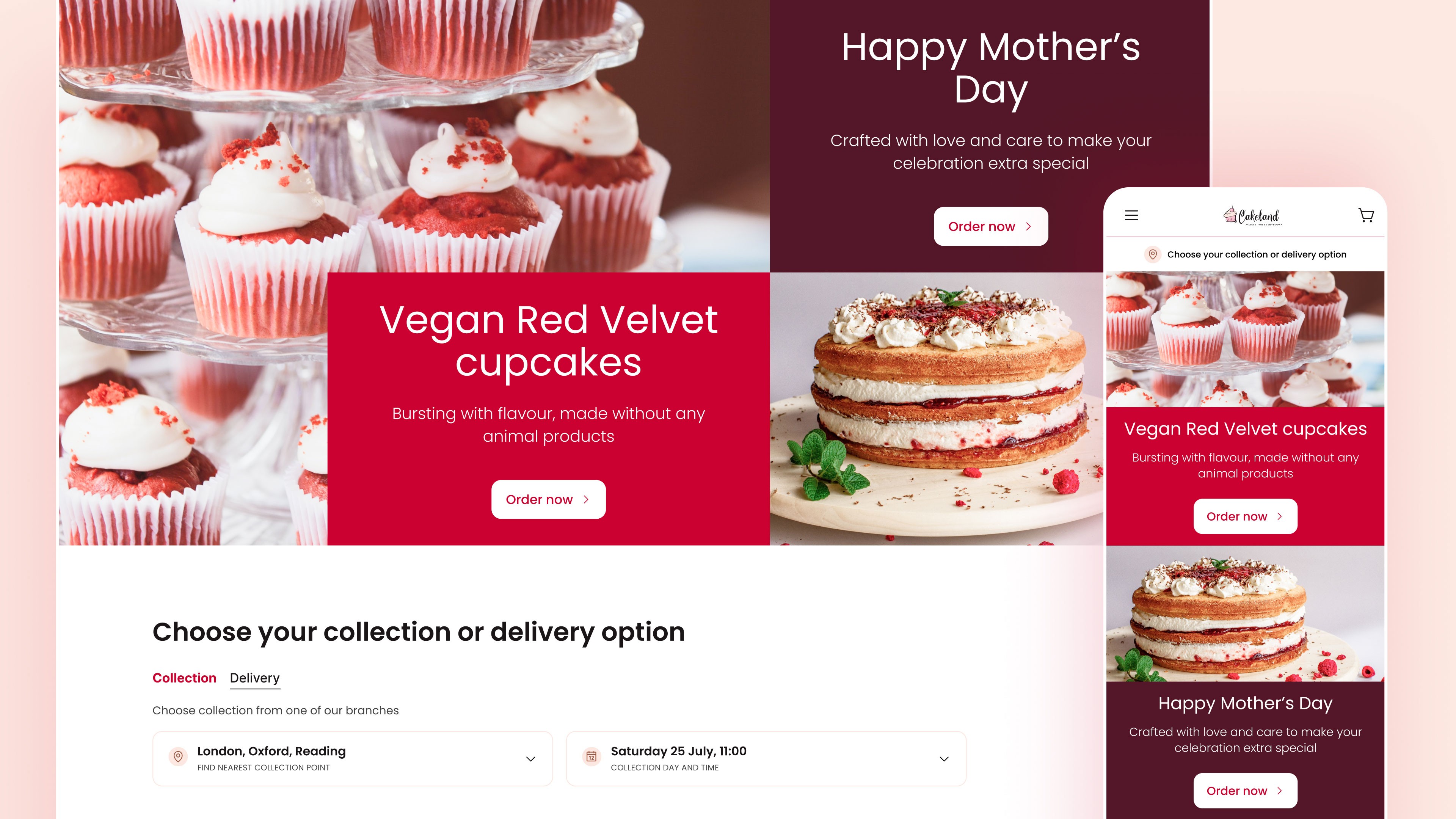
☝🏻 Combination of strong visuals and latest offers - The customers are greeted straight away with images of delicious cakes and the latest offers the bakery has. This is also easy for the bakery to update in CMS.
☝🏻 Delivery or collection booking - Customers are encouraged to choose their delivery or collection before they start browsing the products.
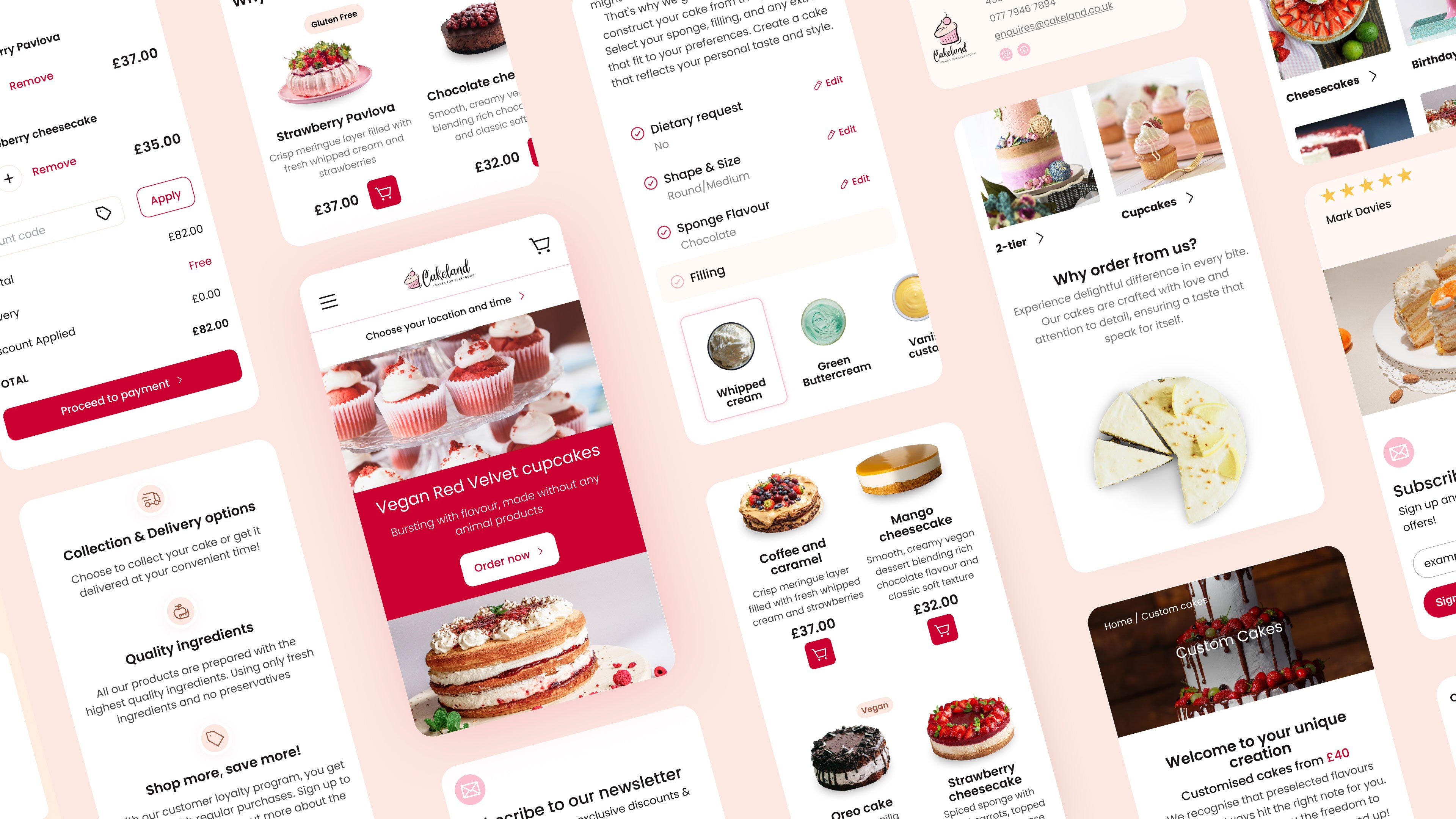
☝🏻 Delivery or collection booking - The design is fully responsive.
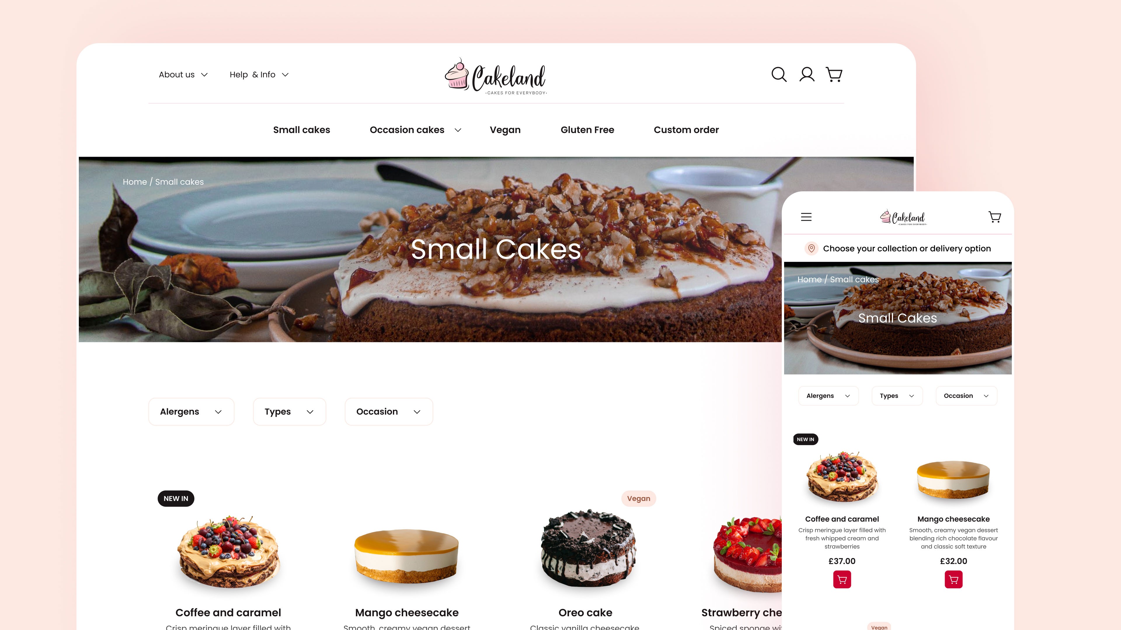
Product list
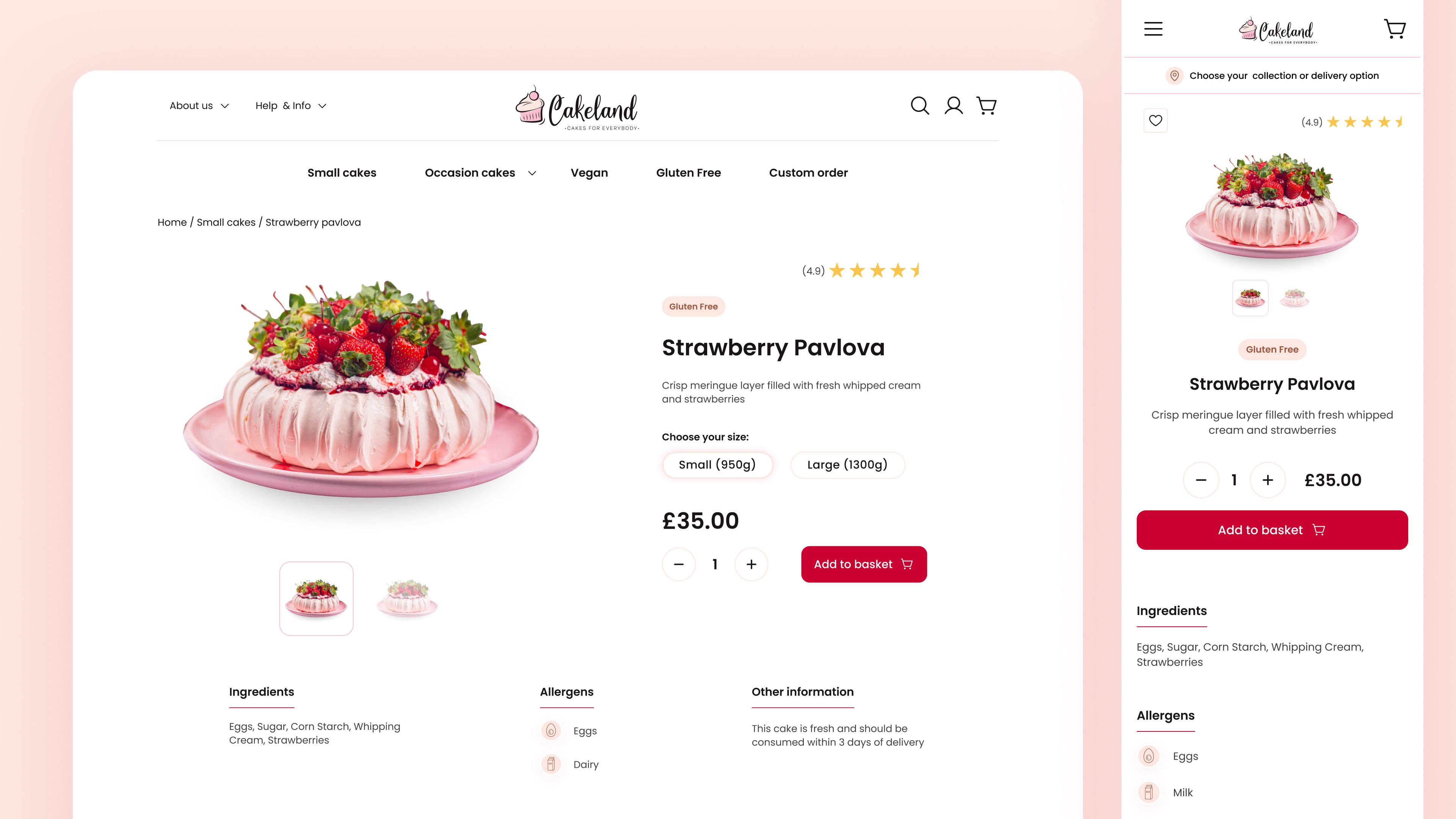
Product detail
Delivery/Collection during the checkout process
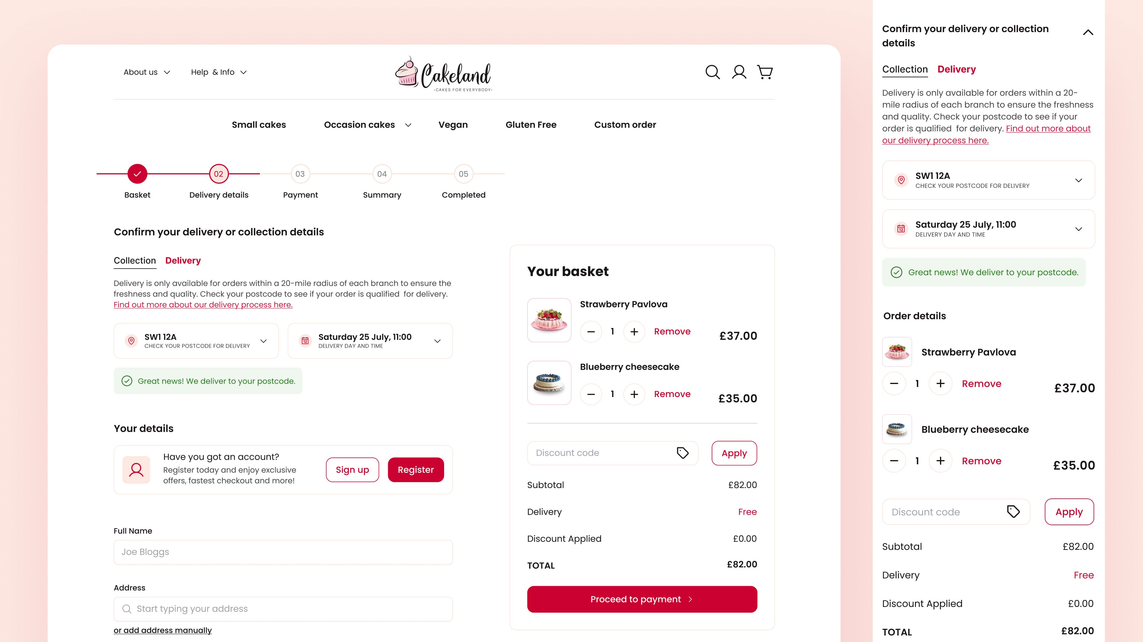
☝🏻 Collection/Delivery toggle - Customers can select the branch and the preferred time for collection. In case of delivery, the customer will input their postcode to see if they are eligible for this service. This component is also located on the landing page so it can be set up before the customers place an order.
☝🏻 Success message - For eligible delivery postcodes, the customer is clearly informed after selecting the postcode. If not eligible, the customer will see a warning message in the dropdown and a suggested solution. 💡 An opportunity to let customers sign up for a newsletter for any updated delivery locations etc. 💡
☝🏻 Guest checkout - Customers don't have to register to place an order
I went through several iterations before I finalised the designs….
One of them was the hero section. I initially designed something funkier but later realised that it would be a lot more work for the client to update, in case of new promotions
The result
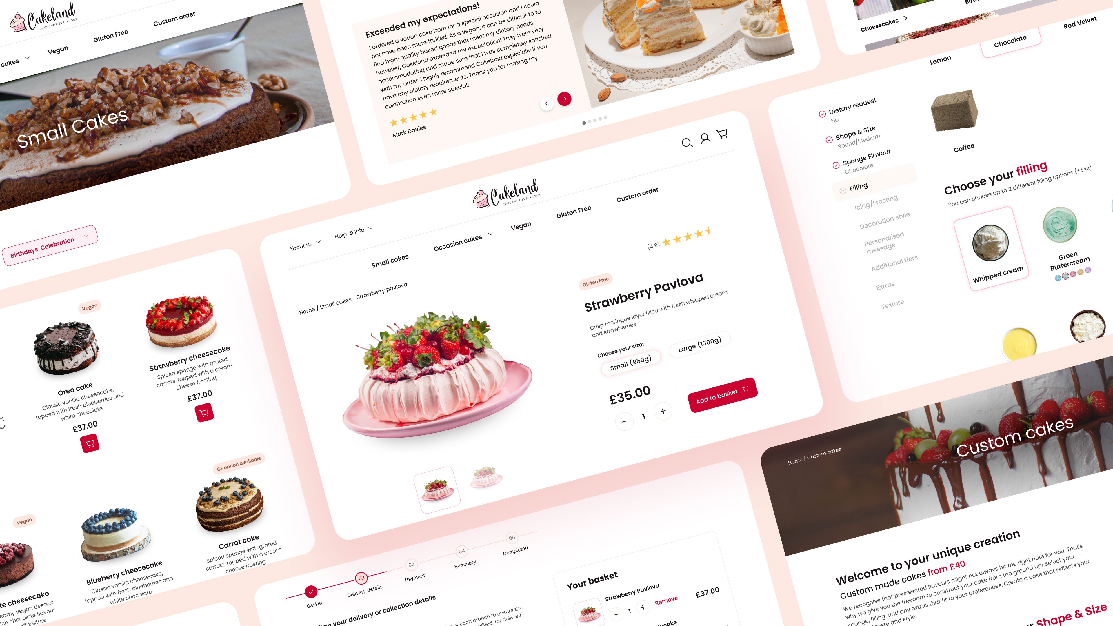
Visual design enhancement: Better quality images, and an improved colour palette that makes the whole design more cohesive. The website meets WCAG standards
User experience improvements: More detailed information regarding products, ordering process explained, ability to order without registering, simplified navigation
Functionality and features: Adding a dedicated page for customers to build and order a custom cake
Accessibility: Improving contrast ratios, implementing keyboard navigation
More projects
Get in touch!
Halfarovajana@gmail.com

